Business Cards for Etsy Sellers: What to Print (and What to Avoid)

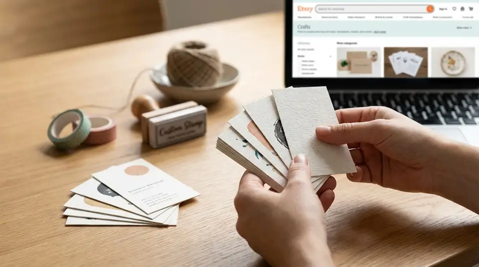
Business cards are a simple, low-cost way for an Etsy seller to turn one order into a repeat customer and make in-person meetups count. Print the essentials: shop name and logo, a short line about what you make, and one easy path back to your storefront, like a clean Etsy shop URL plus a tested QR code. If you add extras, keep them useful and trackable: a single contact email, one social handle you actually post on, and a coupon code or reorder link that won’t expire before the cards run out. Skip tiny fonts, cluttered link lists, and any messaging that feels pushy, because the cards people keep are the ones that solve a small problem, such as quick care instructions or sizing tips on the back.
Business card vs package insert vs care card: choosing the right format
In-person handout cards
If you sell at craft fairs, pop-ups, or local events, a classic business card is the fastest way to be remembered. It’s a “pocket reminder,” not a mini brochure. For Etsy sellers, the best in-person handout cards do three things well: show your brand at a glance, say what you sell, and make it effortless to find your Etsy shop again.
Keep the front simple: shop name, logo, and a short product line like “Handmade silver stacking rings” or “Crochet baby gifts.” On the back, add your Etsy shop link and a QR code that goes to your storefront. Leave a little white space too. It’s useful for writing a booth number, a custom order note, or a restock date.
In-the-package thank you inserts
A package insert is for people who already bought from you on Etsy. That changes the job of the card. Instead of “Who am I?”, it’s “How do you reorder or get help?”
A small thank you insert (often postcard-sized) is great for:
- a warm thank you and brand reinforcement
- one clear next step, like “Scan to shop new arrivals”
- support info, like “Message me on Etsy if anything arrives damaged”
This is also where you can include a reorder hint (“Need another size? Here’s the listing link”) without crowding your business card. If you want more ideas on buyer experience and branding, the Etsy Seller Handbook is a solid place to start.
Care and instruction cards
Care cards are practical. They reduce “How do I use this?” messages and help prevent avoidable damage. If you sell items like candles, jewelry, knitwear, stickers, or apparel, a care and instruction card can be more valuable than another marketing card.
Keep care cards specific to the product and easy to scan. Use short steps, simple icons if they truly help, and plain language. If safety or special handling matters, the care card is the right place for clear warnings and common-sense use notes. You can still add light branding, but the priority is helping the buyer get great results with their purchase.
Must-print details that help buyers find you again
Shop name and logo placement
Print your shop name exactly as it appears on Etsy. Consistency matters more than creativity here. If your cards say one name and your Etsy shop says another, buyers can get stuck or land on the wrong shop.
Place your logo and shop name where the eye naturally goes first, usually centered or top-left. Keep it readable from arm’s length. If your logo is detailed, consider a simplified version for small print so it doesn’t turn into a blur. High contrast helps too, especially if you sell in busy places like markets or craft fairs.
Etsy shop link and QR code
Your Etsy business card should include both a clickable-looking link and a QR code. Some people love scanning. Others will type it in later.
A solid setup is:
- Your Etsy shop URL (often in the format
etsy.com/shop/YourShopName). - A QR code that goes to your shop home page or a “best sellers” page.
- A short label like “Scan to shop on Etsy” so it’s obvious what the code does.
Before you print a batch, test the QR code with a few phones and camera apps. Also make sure the link is short, spelled correctly, and not tucked into tiny text.
Best contact method for support
For Etsy orders, the cleanest support option is usually: “Message me on Etsy.” It keeps the conversation tied to the order and is easy for buyers to find. Etsy also guides buyers to contact sellers through Messages for order help.
If you want to include an email address, use a dedicated business email you actually check. Keep it to one additional contact method. Too many options (email, Instagram DMs, text, contact forms) slows things down and frustrates buyers.
A simple line that works well is: “Need help? Message me on Etsy (fastest).” It’s clear, buyer-friendly, and sets expectations without sounding stiff. You can link that wording to the official buyer steps in Etsy’s help article on How to Contact a Shop.
Nice-to-have extras that boost repeat purchases
Social handle if you actively use it
A social handle can help with repeat purchases, but only if you’re actually active there. If your last post was months ago, it can quietly reduce trust.
If you include one, keep it to one platform and make it clear why someone should follow. For example: “Follow for new releases and restocks.” Make sure the handle matches your branding and is easy to read. Avoid tiny text and long strings of underscores.
A good rule: if you wouldn’t confidently send a customer to that profile today, don’t print it.
Product care, sizing, or reorder notes
This is the most underrated “extra,” especially for physical products. A quick care or sizing reminder can prevent avoidable issues and reduce support messages. It also makes your card feel genuinely useful, which is what gets it saved.
Keep it short and specific. Think 2 to 4 lines, not a full instruction manual. Examples that work well on the back of a card:
- “Jewelry care: avoid water, lotions, and perfumes.”
- “Apparel: wash cold, inside out. Hang dry for longest life.”
- “Reorder tip: scan the QR code to see current colors and sizes.”
If your items vary a lot, consider a separate care card per product type, so your info stays accurate.
Discount code or freebie mention
A small discount can nudge a second order, especially for consumables or giftable items. If you want the simplest approach, Etsy lets you create promo codes and post-purchase “thank you” offers inside Sales and Discounts. You can confirm the current options in Etsy’s help guide on Sales and Discounts.
If you mention a freebie, keep expectations realistic. “Thank-you gift included while supplies last” is safer than promising a specific item every time. And avoid any wording that trades a discount or freebie for a review. It can come off as review manipulation, even if you don’t mean it that way.
Front and back layout that stays readable and uncluttered
Front: brand plus one clear action
Treat the front of your Etsy business card like a sign, not a flyer. Lead with your shop name and logo. Add a short descriptor so people instantly know what you sell, like “hand-poured soy candles” or “personalized pet portraits.”
Then include one clear action. Pick the single next step you want most people to take:
- “Shop on Etsy”
- “Scan to view best sellers”
- “Custom orders available”
When the front has one job, it feels confident and high-end. If you try to squeeze in your Instagram, email, tagline, coupon, and QR code all at once, nothing stands out and the card gets tossed.
Back: details, QR, and a short message
The back is where the helpful details live. A clean back layout usually includes:
- Etsy shop link (easy to type)
- QR code (easy to scan)
- One support line (like “Message me on Etsy for help”)
- A short thank you, kept to one sentence
If you offer variations or reorders, a tiny line like “Reorder colors and sizes via the QR code” can cut down on back-and-forth messages.
Keep the QR code away from the edges so it doesn’t get trimmed off. Also avoid putting any important text right up against the border.
Font size and spacing that scans fast
Small cards need generous spacing. As a baseline, try to keep body text at 10 pt or larger if you can, and avoid thin, trendy fonts for key info like your Etsy link. Use 1 to 2 font families max.
Spacing matters as much as font size. Leave breathing room around your shop name, and give the QR code a clear blank border so phone cameras can read it quickly. If you’re unsure, print a test sheet at home first. Set it on a table and check what you can read in two seconds. That’s the real test.
Etsy seller design tips that make cards feel on-brand
Color and contrast for quick reading
Your business card should feel like your Etsy shop, but it still has to be easy to read in real life lighting. Start with your brand colors, then check contrast. Dark text on a light background is usually the safest. Light text on a dark background can look great, but only if the font is thick enough and the printing is sharp.
If you use photos or textured backgrounds, keep them subtle and avoid placing your Etsy shop link on top of a busy image. A simple trick is to put key info (shop name, URL, QR label) inside a clean, solid-color block so it stays readable.
Simple icon use for trust and clarity
Icons can make a small card faster to scan, but only when they’re obvious. Use them like signposts, not decorations. One small icon next to an email address, an Etsy link label, or a “handmade” note can help the eye land in the right place.
Keep icon style consistent (all line icons or all solid icons). Avoid mixing styles or adding too many. If you include a QR code, a tiny phone or “Scan” icon plus a short label reduces confusion and increases scans, especially at markets where people are moving quickly.
Matte vs gloss for legibility
For most Etsy sellers, matte is the easiest choice. It reduces glare under bright craft fair lights, and it’s easier to write on (handy for custom order notes, restock dates, or a quick thank-you).
Gloss can look punchy and high-contrast, but reflections can make small text and QR codes harder to read in certain angles. If you love a glossy look, consider using gloss only when your design is minimal and your text is large. For a balanced feel, some printers offer a “silk” or soft-touch style finish that sits between matte and high shine.
Printing specs that work for most Etsy business cards
Standard sizes and orientation
In the U.S., the most common business card size is 3.5 x 2 inches. It fits standard wallets and card holders, which makes it more likely customers keep it after buying from your Etsy shop.
Orientation is a design choice:
- Horizontal feels traditional and gives you more room for a wide logo or shop name.
- Vertical can look modern and can help your card stand out on a vendor table, as long as the text stays easy to read.
If you ship small items, also think about how the card fits in your packaging. Standard size cards slide into most mailers and boxes without bending.
Paper thickness and finish choices
For a professional feel, many Etsy sellers land in the 14 pt to 16 pt range (often roughly 300 to 400 gsm, depending on the paper). Thicker stock holds up better in purses, pockets, and shipping.
Finish depends on how you’ll use the card:
- Matte is a safe all-around choice. It’s easier to read under bright lights and easier to write on.
- Gloss looks vibrant, but glare can make small text harder to read.
- Uncoated feels more “handmade” and is very writable, but can scuff sooner.
Printer-ready file basics (no jargon)
To avoid blurry logos and surprise trimming, set your file up with a few basics:
- Export a PDF (most printers prefer it).
- Use high quality images (aim for 300 dpi if you’re using photos).
- Add a little extra background past the edge (called bleed) so you don’t get thin white borders after trimming.
- Keep important text and QR codes away from the edge (a safe margin) so nothing gets cut off.
- Test print at home at 100% size to confirm the Etsy link, QR code, and font size are all readable.
What should you avoid printing on Etsy business cards?
Spammy review requests and policy risky wording
Avoid anything that pressures a buyer to leave a specific rating. A subtle “Reviews help small shops” is usually fine, but “Leave a 5-star review” can feel pushy and backfire.
Most importantly, do not offer a reward for a positive review. Etsy treats “additional goods, services, or compensation in exchange for a positive review” as extortion, which is prohibited. You can read the exact wording in Etsy’s Extortion policy.
Also skip lines that try to control how a buyer handles problems, like “Don’t contact Etsy” or “Never open a case.” If there’s an issue, you want the buyer to feel supported, not managed.
Too many links, platforms, or QR codes
More links do not equal more sales. They usually create decision fatigue. A business card works best when it has one primary destination: your Etsy shop.
Try not to print multiple QR codes (Shop, Instagram, TikTok, Linktree, newsletter, etc.). It can look cluttered, and some buyers are wary of scanning codes if it’s not clear where they go. One QR code plus a readable Etsy URL is the sweet spot.
Also avoid sending people to off-Etsy checkout options on your card. Etsy notes it may not be able to consider off-Etsy communication or transactions, so keeping support and order context on Etsy is often safer for both sides.
Personal details you may not want shared
Think twice before printing personal contact info that can spread beyond the original buyer. A phone number and home address can be hard to “unprint.”
If you need an address for returns, consider a PO box or a dedicated business mailing address. For contact, a single business email or “Message me on Etsy” is usually enough. Keep personal social accounts, last names, and anything you’d regret if a stranger photographed your card off the table.
Related posts
Keep reading
Google Ads for Etsy Sellers: When It Works Better Than Marketplace Ads
Google Ads for Etsy sellers can outperform Etsy Ads for niche, high-intent keywords and repeat buyers; weigh CPC, offsite fees, and tracking limits first.

California Prop 65 Basics for Etsy Sellers (When Warnings Apply)
California Prop 65 for Etsy sellers: when warnings apply, which materials commonly trigger them, and where to place a clear-and-reasonable notice online.
Holiday Shipping Deadlines for Etsy Sellers (Planning Guide)
Holiday shipping deadlines guide for Etsy sellers with USPS, UPS, FedEx cutoff dates, processing times, packaging tips, and planning strategies to avoid late deliveries.
EU GPSR and Etsy Sellers: What Product Safety Info to Prepare
EU GPSR for Etsy sellers: prep manufacturer and EU Responsible Person contact details, product IDs, plus clear safety warnings and instructions by country.
How to Separate Personal and Business Finances for Your Etsy Shop
Separate personal and business finances by using a dedicated bank account and card, tracking Etsy fees and payouts, and keeping clean, tax-ready records.

How to Use Trade Shows to Grow Your Etsy Brand (Plan + Checklist)
Etsy trade shows: practical timeline and booth checklist for inventory, pricing, QR-code payments, email capture, and follow-up that brings buyers back.