How to Create High-Converting Mockups for Etsy Digital Products

Etsy mockups are styled, product-like visuals that help shoppers instantly understand your digital download and feel confident clicking from the search grid into your listing. The highest-converting ones start with a clean hero image that reads at thumbnail size, then back it up with 2 to 3 supporting visuals like an in-context device or frame scene, a close-up that proves clarity, and a simple “what’s included” layout (pages, formats, and key features). Keep shadows and perspective believable, stick to one consistent look across your listing photos, and avoid clutter or tiny text that disappears on mobile. The sneaky conversion killer is designing for beauty at full size instead of legibility in Etsy’s crop.
Why mockup images increase clicks and sales on Etsy
What buyers look for in digital product previews
On Etsy, buyers move fast. Your mockup has one job first: make the digital product instantly understandable at thumbnail size. Shoppers want to confirm three things in seconds: what it is, what style it matches, and whether it will work for their use case.
High-converting digital product previews typically show the “end result” first (the wall art in a frame, the planner on an iPad, the template on a laptop), then remove uncertainty with a quick proof image. That might be a crisp close-up, a page spread, or a simple “what’s included” visual. When your mockup answers basic questions before the buyer clicks, you earn the click more often.
Realistic scenes vs flat previews for perceived value
Flat previews (a clean, straight-on layout on a neutral background) are great for clarity. They let buyers see fonts, spacing, and details without distractions. But realistic mockup scenes do something different. They help shoppers imagine ownership. A frame on a wall communicates scale. A workbook held in hand makes it feel more “real,” even if the product is a download.
The best Etsy listing image sets usually use both. Lead with one clear, lifestyle-style hero mockup. Follow with 1 to 2 flatter previews that show the contents and legibility.
Common mockup mistakes that reduce trust
Mockups can also hurt conversion when they feel misleading or messy. Common trust-killers include unrealistic proportions (tiny art in a huge frame), heavy filters that change colors, and cluttered scenes that hide the actual design.
Other frequent issues: tiny text that becomes unreadable on mobile, inconsistent lighting and shadows across images, and too many badges or claims that distract from the product. When in doubt, prioritize accuracy and clarity. A believable mockup that matches what the buyer will receive is what builds confidence and reduces returns and complaints.
Etsy image rules for digital product mockups and previews
File types, sizes, and aspect ratios that display well
Etsy supports listing images in .JPG, .PNG, or .GIF. Keep it simple with JPG for most mockups. Etsy does not support animated GIFs or transparent PNGs. Transparent areas can display as black, which looks like a broken mockup. The official requirements and best practices are worth bookmarking in Etsy’s help article on Images in Your Etsy Shop.
For size, Etsy recommends listing photos at 2000 pixels or more. Your first photo should be at least 635 pixels wide and tall, or it may show lower in search. Etsy also recommends sRGB color to avoid weird color shifts after upload.
For aspect ratio, plan for cropping. Etsy strongly favors a horizontal (landscape) or square first image, and that first image dictates the shape of the rest. Center the main design with extra breathing room so it survives thumbnail crops.
Avoiding misleading images and policy issues
Mockups are fine, but your images must not create the impression a buyer is receiving something they are not. For digital products, that usually means avoiding “looks physical” scenes without clear context (frames, binders, clipboards, desks full of props) unless it’s obvious the props are just styling.
Etsy’s Listing Image Requirements are strict for many categories. While digital downloads are different from physical handmade items, the core expectation is the same: be accurate and transparent.
Using all listing image slots with purpose
Etsy currently allows up to 20 photos per listing, plus one video. Use that space like a mini sales page:
- 1 hero mockup that reads at thumbnail size
- 2 to 4 “what you get” previews (pages, variations, layouts)
- 1 close-up for crispness (fonts, textures, margins)
- 1 compatibility or format graphic (PDF, PNG, sizes, apps)
- 1 simple reminder that it’s a digital download (no physical item shipped)
Mockup styles that match popular Etsy digital products
Printable wall art, posters, and frames
For printable wall art, your mockup style should solve two buyer questions: “Will this look good in my space?” and “What size is it?” Lifestyle scenes work best as the first image, but keep the room minimal so the artwork stays the hero.
A reliable structure is: one clean frame-on-wall mockup, one close-up crop for texture and sharpness, and one size-focused preview. If you offer multiple ratios (like 2:3, 3:4, 4:5, A-series), show them in a simple comparison image with big, readable labels. Avoid frames with thick mats that shrink the visible design, since it can make your art feel smaller than it is.
Color accuracy matters here. If the mockup lighting warms everything up, your “sage green” printable can look beige, and that can trigger messages, refunds, or bad reviews. Use neutral backgrounds when your artwork color is a key selling point.
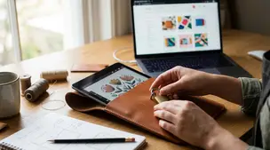
Planners, templates, and workbook interiors
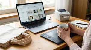
Planners, spreadsheets, Canva templates, and workbooks sell on usability. Your mockups should highlight the interface and the layout, not the props.
Device mockups are ideal, but choose scenes where the screen is large and straight enough to read. Then support it with “interior” previews: a two-page spread, a monthly and weekly example, and 1 to 2 feature callouts (tabs, trackers, formulas, sections). If the product is editable, show an “editable text” cue inside the preview, not as a tiny badge in the corner.
For templates, include one image that clearly states what the buyer needs to use it (for example, Canva, Google Sheets, or PDF). Clarity here reduces post-purchase confusion.
Bundles and multipacks without visual clutter
Bundles can look impressive or overwhelming. The trick is to show variety without turning the image into a collage of unreadable thumbnails.
Start with one hero image that communicates the bundle count and theme. Then break the bundle into groups across the next images (for example, “Set 1: neutrals,” “Set 2: bright,” “Set 3: seasonal”). Use consistent spacing, aligned edges, and repeating mockup frames so the layout feels organized.
When you need to show many pages, swap tiny previews for a clean “What’s included” checklist paired with 3 to 6 large sample pages. Buyers do not need to see everything at once. They need proof of style, quality, and coverage.
Lighting, shadows, and backgrounds that make mockups look real
Choosing props and scenes that fit your niche
The fastest way to make an Etsy mockup feel believable is to match the scene to the buyer’s world. A minimalist printable looks at home in a clean, modern room. A nursery print fits soft fabrics and gentle colors. A business template fits a tidy desk with practical objects.
Keep props secondary. Use one to three supporting items, not a full flat-lay spread. When the scene is too busy, shoppers stop looking at the design and start scanning the background. Also watch for props that accidentally change the message, like mugs with slogans, branded devices, or seasonal decor that makes a year-round product feel temporary.
If you sell multiple products in the same shop, reuse a few signature scenes. Consistency across mockups makes your storefront look more professional and helps buyers recognize your style in search.
Matching color and contrast to your artwork
Lighting and background choice should protect readability first. If your design uses light pastels, avoid pale beige walls or white desktops that wash it out. If your design is dark and moody, avoid harsh white scenes that make it look flat.
Aim for neutral lighting and realistic contrast. Many mockups fail because the artwork is either too saturated (looks fake) or too low-contrast (looks dull). A good check is to zoom out until the image is thumbnail-sized. If the main title, headline, or focal illustration disappears, increase contrast, simplify the background, or choose a different scene.
Also keep an eye on color consistency across your full image set. If your first mockup is warm and your second is cool, the artwork can appear “different,” even when it is the same file.
Shadow direction and softness for realism
Shadows are what make a mockup feel physically present. They should follow one consistent light source. If the scene light comes from the left, the frame shadow should fall to the right. If the scene is soft and cloudy, the shadow should be soft. If the light is direct, the shadow can be sharper, but still natural.
Avoid floating effects. If a poster “hovers” with no contact shadow, buyers subconsciously read it as pasted-on. A small, soft contact shadow along the bottom edge, plus a gentle cast shadow, usually looks most convincing. Keep shadow opacity low. It should support realism, not announce itself.
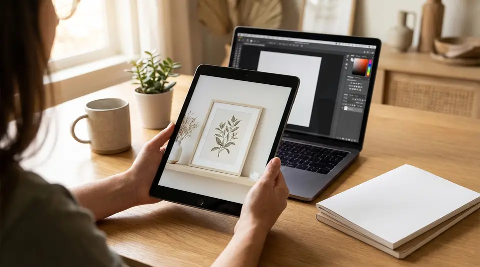
Creating mockups with Placeit, Canva, Photoshop, or PSD templates
Picking the right tool for your workflow
The “best” mockup tool is the one that lets you produce consistent Etsy listing images quickly, without sacrificing clarity.
- Placeit-style generators are best when you want speed and realistic scenes with minimal setup. They’re great for posters, apparel-style visuals, and simple device screens. The tradeoff is less control. You can end up with mockups that look similar to other sellers if you rely on the most popular scenes.
- Canva is a strong choice for clean, branded preview sets. It’s ideal for “what’s included” slides, bundle breakdowns, sizing charts, and simple frame or device compositions. It’s also friendly for batch variations.
- Photoshop (and PSD mockup templates) gives the most realism and control, especially for natural shadows, texture, and accurate perspective. It’s often the best path if you sell in volume or your niche demands premium-looking mockups.
A practical approach many Etsy sellers use is a hybrid: generate or edit one strong hero mockup, then build the rest of the listing image set in a consistent Canva layout.
Working with smart objects and layered files
If you’re using PSD mockups, look for templates built around Smart Objects. You double-click the Smart Object layer, paste your design, save, and the mockup updates automatically. That saves hours over manual warping and masking.
Before you commit to a PSD set, check:
- The template supports the orientations you sell (portrait, landscape, square).
- Shadows and highlights are on separate layers (so you can reduce intensity).
- The frame mat, background, and texture can be toggled off (so your design stays legible for Etsy thumbnails).
For digital products with multiple pages (planners, workbooks), layered files help you build consistent interior previews without redoing the full layout each time.
Saving reusable scenes for faster variations
Mockup consistency is a conversion advantage on Etsy because your shop looks cohesive in search and in your storefront grid. To speed that up, create a small library of reusable scenes:
- 2 to 4 hero scenes for your main product types (frame wall, desk flat lay, device).
- 1 reusable “details” layout (close-up crop + feature callouts).
- 1 reusable “what’s included” layout for bundles, formats, and sizing.
Save these as templates with your safe margins already set for Etsy cropping. Then each new product becomes a simple swap: replace the artwork, update the labels, export, and you’re ready to upload.
A repeatable workflow for producing consistent mockup sets
Planning a cohesive set of 7 to 10 listing images
A strong Etsy mockup set feels like one story, not random pictures. Plan your images before you design them, so each slot has a job. For most digital products, 7 to 10 images is a sweet spot. It’s enough to answer questions without overwhelming the buyer.
A simple, repeatable structure looks like this:
- Hero mockup: the clearest, most clickable scene at thumbnail size.
- Instant clarification: a flat preview or close-up that proves legibility.
- What’s included: pages, files, variations, or bundle count.
- How it’s used: device mockup, print example, or real-life context.
- Key features: 2 to 3 short callouts (sections, trackers, editable areas).
- Sizing and ratios: important for wall art and printables.
- Compatibility and delivery: file types, software, and “digital download” reminder.
Keep the same background style, margins, and typography across the set so the listing looks cohesive in Etsy search and on your shop page.
Batch editing and versioning for multiple products
Consistency is much easier when you treat mockups like a production line. Create one “master” template set for each product type (wall art, planner, template), then duplicate it for each new listing.
Use a naming system that prevents mix-ups, like:
- ProductName_Size_or_Version_Date
- ProductName_Hero / ProductName_Includes / ProductName_Closeup
When you version a design (new colorway, new quote, new layout), change one thing at a time. Keep the same hero scene and the same “what’s included” layout. Buyers recognize your brand faster, and you spend less time reinventing.
Quality control before publishing
Before you upload, do a quick QC pass with the buyer’s perspective. Open your images at small size. If the design is hard to understand at a glance, your click-through rate will suffer.
Check these basics:
- Text is readable on mobile and not squeezed into corners.
- Colors look consistent across all images.
- Shadows and perspective match the scene (no floating frames or warped screens).
- “What’s included” matches the actual download files.
- Any physical props don’t imply a physical item is shipped.
This final check takes minutes, but it protects your Etsy conversion rate and reduces customer messages after purchase.
Export settings and file optimization for crisp Etsy listing images
Sharpening and compression without artifacts
Etsy compresses images after upload, which can soften fine details. A light, intentional sharpen before exporting keeps your mockups looking crisp once they hit Etsy’s compression pipeline. Keep it subtle. Over-sharpening creates crunchy edges and ugly halos around text.
For most mockup photos, export as JPG with high quality (often around 80 to 90 in many editors). That usually holds detail without making files unnecessarily heavy. Use PNG when your image is mostly flat color and text (like a “what’s included” slide), but avoid transparency, since Etsy doesn’t support transparent PNGs.
Convert to sRGB before export to reduce color shifts. Etsy recommends sRGB, and notes that larger files can struggle to upload on slower connections. The official guidance is in Etsy’s Requirements and Best Practices for Images in Your Etsy Shop.
Cropping for the Etsy search grid and thumbnail
Your first listing photo becomes your thumbnail, and Etsy may crop it differently across placements. Build mockups with a safe zone: keep the key design centered, with generous margins around it.
Etsy also recommends your first photo be horizontal (landscape) or square, and that it’s at least 635 x 635 px to avoid showing lower in search. For best clarity, aim for 2000 px or more on both sides.
File naming and metadata basics for organization
File names won’t directly improve Etsy SEO, but they will save you hours. Use a consistent naming pattern like:
product-name_mockup-hero_v1.jpgproduct-name_includes_8x10-5x7.jpgproduct-name_closeup_detail.jpg
Keep a single folder per listing, and store your editable source (PSD/Canva) beside exports. When you update a design later, you’ll be able to regenerate an entire Etsy image set in minutes without guessing which file is the latest.
Related posts
Keep reading
How Much Money Can You Make Selling on Etsy?
Discover realistic Etsy income ranges, profit margins, fees, and proven tips to boost sales so you can grow your handmade or digital product shop confidently.

How to Break Even Faster on Etsy
Learn how to break even faster on Etsy with smart pricing, fee-cutting tactics, bestseller research, SEO-powered listings, and affordable Etsy Ads strategies.
Why Sell on Etsy? Key Benefits Explained
Discover why selling on Etsy boosts your handmade brand visibility, low startup costs, built-in traffic, loyal buyers, and flexible, low-risk income.

What Products Can You Sell on Etsy?
Discover exactly what you can sell on Etsy—from handmade crafts and digital downloads to vintage treasures and craft supplies—and start growing a joyful shop today.
How to Protect Digital Files From Theft on Etsy
Protect Etsy digital downloads from theft with smart watermarks, secure file delivery, licenses, DMCA takedowns, and piracy monitoring to safeguard your profits.
Print-on-Demand on Etsy: What to Know Before You Start
Print on demand on Etsy: understand production partner rules, fees, margins, shipping times, and listing SEO so your shop stays fully compliant and clear.