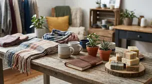
Etsy Featured Listings: How to Curate Your Shop Homepage

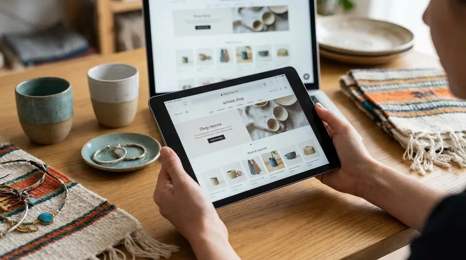
Etsy Featured Listings are the four products you pin to the top of your Shop Home, giving shoppers an instant snapshot of what you sell and the quality they can expect. Treat that row like a mini storefront window display: pick items with clear demand (best sellers, a seasonal highlight, a signature style), and make sure the main photos look cohesive in lighting, background, and color. Keep a small featured queue so sold-out or deactivated items don’t leave dead space, and arrange the order to guide the eye from your hero product to easy add-ons. One surprisingly common misstep is featuring “pretty” items that don’t actually match the rest of your shop’s promise.
Etsy Shop Home first impressions shoppers notice fastest
Banner and icon working together
Your Etsy Shop Home gets judged in seconds. The fastest signal is whether your banner and shop icon feel like they belong to the same brand. Aim for one clear visual idea across both. That can be a consistent logo mark, the same font style, or a repeated pattern.
Keep the shop icon simple enough to read when it’s tiny. Etsy shows it in more places than just your homepage, so a clean symbol usually works better than a full wordy logo. Your banner can do the heavier lifting by showing your product category at a glance: “handmade soy candles,” “minimalist printable wall art,” or “silver birthstone jewelry.”
If you are unsure about image types and recommended sizes Etsy accepts for banners and icons, follow Etsy’s own guidelines in How to Customize Your Shop's Appearance.
Color choices that match your product style
Color is your shortcut to “this shop is for me.” Pick 2 to 4 brand colors that match what you sell and how it’s used. Soft neutrals and warm tones often suit cozy, giftable products. High contrast palettes can fit bold art or modern accessories.
The key is consistency. If your listings have bright, saturated photos but your banner is muted and minimal, shoppers can feel a mismatch. Use your banner colors to echo your listing photo backgrounds, props, and packaging.
Clean layout for quick browsing
A clean Shop Home helps shoppers find something fast. Prioritize:
- Simple banner text (or none at all) so products stay the focus
- Cohesive main listing photos, so the grid looks organized
- Sections that read like shopper language, not internal SKU labels
When your layout is easy to scan, shoppers spend less time figuring out what you sell and more time clicking into listings. That is the goal of a high-converting first impression on Etsy.
Shop banner design that highlights products and branding
Banner styles that fit your shop aesthetic
A strong Etsy shop banner does one job fast: it tells a shopper what you sell and what your style feels like. The simplest approach is a clean “brand banner” with a subtle texture or solid color, plus your shop name. This works well if your listing photos already do the heavy lifting.
If your products are highly visual (art prints, candles, ceramics, jewelry), a product-forward banner often converts better. Use one hero product photo, or a tidy lineup of 2 to 4 products that look cohesive together. Keep the props minimal so it does not compete with your listing thumbnails below.
Etsy also offers different banner formats depending on your shop settings and plan. If you use a larger banner, keep the composition roomy so nothing important gets cropped on different screens. Etsy’s own image guidelines are worth following so your banner stays crisp and properly sized on desktop and mobile, especially if you switch between mini, big, or carousel-style layouts. You can check the current banner size requirements in Etsy’s Requirements and Best Practices for Images in Your Etsy Shop.
Text on banners that stays readable
Banner text should be short and high-contrast. Think: shop name, a tight tagline, or a quick category phrase. Avoid thin scripts, long sentences, and small type. If you want text over a photo, add a light overlay behind the text so it stays readable without looking harsh.
Seasonal banner updates without rebranding
Seasonal updates work best when they feel like the same brand wearing a different outfit. Keep your logo placement and core colors consistent. Then rotate one element: a seasonal product photo, a small “holiday gifts” callout, or a limited color accent. This keeps your Shop Home fresh without confusing returning shoppers who are looking for your signature style.
Shop icon and owner photo that build trust quickly
Choosing a clear, recognizable shop icon
Your shop icon is one of the smallest images shoppers will see, which is exactly why it matters. When it’s tiny, detail disappears. Aim for a simple, high-contrast design that still reads at thumbnail size.
Most Etsy sellers do best with one of these icon styles:
- A clean logo mark (a symbol, monogram, or stamp-style badge)
- A short shop name in a bold, legible font
- A single product silhouette (only if your category is instantly recognizable)
Avoid crowded collages and long text. If someone has to squint to understand it, it is not doing its job. A recognizable icon also helps when shoppers see your listings in search, favorites, and carts, not just on your Shop Home.
Using an owner photo to humanize your shop
An owner photo can add quick credibility, especially for handmade and custom shops. It reassures buyers there’s a real person behind the messages, timelines, and problem-solving.
Keep it simple: a well-lit head-and-shoulders photo, neutral background, and a friendly, professional expression. If you prefer privacy, you can still “humanize” your shop with an on-brand logo photo, a studio shot (hands working, packaging station), or a lifestyle image that matches your product vibe. The goal is comfort and clarity, not perfection.
Consistent imagery across your Shop Home
Trust builds when everything looks like it came from the same shop. Match your icon, owner photo (or brand image), banner, and listing photos with consistent lighting and color temperature. Use similar backgrounds or props across your featured listings, too, since those items sit near the top and get noticed first.
If you ever rebrand, update these visuals as a set. A new banner paired with an old icon is a subtle mismatch that can make your shop feel unfinished, even if your products are excellent.
Featured listings that guide shoppers to best sellers
Picking four listings to feature with purpose
Your Etsy featured listings are prime real estate. They sit at the top of your Shop Home, so they should answer two questions instantly: “What does this shop sell?” and “What should I buy first?”
Instead of picking four random favorites, choose featured items with a clear job:
- One bestseller that already converts well and sets expectations for quality and price.
- One signature style that represents your brand (your “known for this” product).
- One easy gift (popular recipient, simple sizing, fast decision).
- One seasonally relevant item or new arrival to keep the shop feeling active.
Etsy lets you feature four listings, and you can add more to a featured queue so the row stays filled if an item sells out or gets removed. Etsy explains how the featured queue works in its guide to Customizing the Look of Your Shop Home.
Ordering featured items by theme, price, or season
Order matters because shoppers scan left to right. Put the strongest “hero” item first. Then build a logical path:
- By theme: a mini collection (same material, motif, or recipient).
- By price: start with a mid-range bestseller, then show a lower-priced add-on and a premium upgrade.
- By season: lead with the most time-sensitive item (holiday, wedding season, back-to-school).
Whatever you choose, keep the main photos visually cohesive so the row looks intentional.
Keeping featured listings fresh without confusing shoppers
Refreshing featured listings works best when you rotate with a plan, not constant change. Keep a stable anchor (your core bestseller), then swap 1 to 2 spots for new drops, seasonal items, or limited runs. Also watch for sold-out or deactivated listings. Etsy only displays active featured listings, so a well-stocked queue prevents awkward gaps and keeps your Shop Home looking current.
Shop sections and listing order for easier navigation
Creating shop sections shoppers actually use
Shop sections are your Etsy navigation menu. When they are named like real shopper intent, people click them. When they are named like internal categories, they get ignored.
Start by grouping your products the way a buyer thinks:
- Product type (Stud Earrings, Hoop Earrings, Necklaces)
- Recipient (Gifts for Mom, Gifts for Teachers)
- Use case (Wedding, Everyday, Self Care)
Keep section names short and obvious. Etsy caps section names at 24 characters, and you can create up to 20 custom shop sections, so you have room to stay specific without overcomplicating it. Etsy’s step-by-step setup is in How to Create and Manage Shop Sections.
Arranging listings within sections for discovery
Once sections exist, listing order becomes your silent salesperson. A smart default is to place your best-converting items first, then variations, then niche designs. That way shoppers see your strongest proof early, but still have reasons to browse.
Within a section, aim for visual rhythm. Alternate close-ups and lifestyle shots if you use both. Avoid showing ten near-identical thumbnails in a row, even if they are different colors. It can feel repetitive and make shoppers bounce.
Using sections to support collections and gifting
Sections work especially well for collections and gifting because they reduce decision fatigue. A “Gifts Under $30” section, for example, tells shoppers you understand their budget and helps them buy faster.
Think of your featured listings as the hook, and your shop sections as the guided tour. When those two match, your Shop Home feels organized, trustworthy, and easy to shop.
About section and shop story that supports your brand
What to include in your shop story
Your Etsy About section is where shoppers decide if there’s a real, reliable business behind the listings. Keep your shop story simple and specific. Explain what you make, who it’s for, and what makes it different. Then add a few details that answer the questions buyers quietly have before they click “Add to cart.”
Good shop story basics:
- What you sell and the style (so shoppers know they’re in the right place)
- Your “why” in a sentence or two (why this product, why this niche)
- A quick process overview (materials, method, and what’s handmade or designed by you)
- What customers can expect (custom options, typical turnaround approach, packaging vibe)
Etsy encourages sellers to share their creative process and the story behind their products in the About section, and you can support that story with photos or video. You can see the full set of options in Etsy Help’s How to Edit Your Shop’s About Section.
Photos and details that reinforce credibility
Use photos that prove the work is real. A clean workspace shot, tools and materials, in-progress photos, and packaged orders all build confidence. If you offer personalization or made-to-order items, a short process photo sequence can reduce pre-purchase anxiety.
If more than one person helps run the shop, add shop members and roles. It’s a small detail that can make your shop feel more legitimate and transparent.
Linking your story to featured products and sections
Your About section should point shoppers back to buying paths. Mention the same product categories you use in your shop sections, and name one or two featured listings as examples of your signature style. When your story, sections, and featured listings use consistent language, your Shop Home feels cohesive, and shoppers can browse with less hesitation.
How to optimize Shop Home text for Etsy search signals
Shop title and announcement keywords that fit your niche
Your Shop Home text should do two things at once: help a real shopper understand what you sell, and give Etsy clear context about your niche.
Start with your shop title. Etsy allows up to 55 characters, so use plain language that matches your core product and style. Think “Minimalist sterling silver jewelry” or “Printable wedding templates and signs.” Avoid cute slogans that do not describe what you make.
Next, treat your shop announcement like a helpful, keyword-aware note. Keep it short. Put the most important phrase near the beginning, then add what shoppers care about today: processing time, customization, gift messaging, or a seasonal deadline. Etsy’s guidance for adding and editing your shop title and announcement is in How to Add a Shop Announcement and Shop Title.
Section names that match shopper searches
Shop section names can support browsing and reinforce relevance. Use the same words shoppers use in Etsy search: “Stud Earrings,” “Baby Shower Games,” “Teacher Gifts,” “Custom Pet Portraits.” Keep sections clean and specific, and align them with your best-selling categories.
If you sell variations of one item (like multiple scents or colors), consider sections based on buyer intent (Gift Sets, Bestsellers, New Arrivals) instead of internal labels.
Avoiding keyword stuffing while staying specific
Keyword stuffing usually backfires because it reads messy and can reduce trust. A good rule: if it sounds unnatural when read out loud, simplify it. Use one clear primary phrase per field (title, announcement, section name), then let your listings do the deeper keyword work through strong titles, categories, and tags.
Related posts
Keep reading
How Much Money Can You Make Selling on Etsy?
Discover realistic Etsy income ranges, profit margins, fees, and proven tips to boost sales so you can grow your handmade or digital product shop confidently.
How to Break Even Faster on Etsy
Learn how to break even faster on Etsy with smart pricing, fee-cutting tactics, bestseller research, SEO-powered listings, and affordable Etsy Ads strategies.
Why Sell on Etsy? Key Benefits Explained
Discover why selling on Etsy boosts your handmade brand visibility, low startup costs, built-in traffic, loyal buyers, and flexible, low-risk income.
What Products Can You Sell on Etsy?
Discover exactly what you can sell on Etsy—from handmade crafts and digital downloads to vintage treasures and craft supplies—and start growing a joyful shop today.

How to Protect Digital Files From Theft on Etsy
Protect Etsy digital downloads from theft with smart watermarks, secure file delivery, licenses, DMCA takedowns, and piracy monitoring to safeguard your profits.
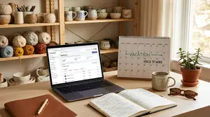
Etsy Vacation Mode: When to Use It (and How to Come Back Strong)
Etsy vacation mode helps pause orders for buyers and hide listings; use a clear shop announcement and auto-reply, then relaunch with fresh listings and promos.