Etsy Shop Banner Guide: Sizes, Safe Areas, and Design Tips

An Etsy shop banner is the wide image at the top of your storefront that sets expectations fast, before a shopper reads a single word. Etsy supports two main formats: a big banner (minimum 1200 x 300 px, commonly designed at 1600 x 400 px) and a mini banner (minimum 1200 x 160 px, commonly designed at 1600 x 213 px), plus carousel and collage layouts for Etsy Plus. Because the banner can be cropped differently on desktop and mobile, treat the middle as your safe area and keep your logo, tagline, and hero product shot away from the edges. Use clean, high-contrast text sparingly, export in sRGB, and expect a bit of compression that can punish tiny details.
Etsy shop banner types and the current size requirements
Mini banner vs big banner dimensions
Etsy gives you two main shop banner choices: mini and big. They both sit at the top of your shop, but they create a different feel.
A mini shop banner is a slimmer header. It works well if you want your shop icon and listings to stay front-and-center. The minimum size is 1200 x 160 px, and the recommended size is 1600 x 213 px.
A big shop banner gives you more vertical space for a strong brand visual, a lifestyle photo, or a seasonal promotion. The minimum size is 1200 x 300 px, and the recommended size is 1600 x 400 px.
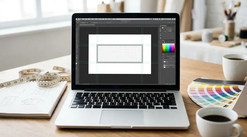
If you are designing from scratch, start with the recommended size. It usually holds up better after Etsy compresses and scales the image. For the official, always-current requirements, see Etsy’s Requirements and Best Practices for Images in Your Etsy Shop.
Etsy Plus carousel and collage banner sizes
If you subscribe to Etsy Plus, you can also use carousel and collage banners.
For a carousel banner, Etsy recommends 1200 x 300 px for each image. A carousel rotates through multiple images, so keep each slide simple and readable.
For a collage banner, the recommended size depends on how many images you include:
- 2 images: 600 x 300 px each
- 3 images: 400 x 300 px each
- 4 images: 300 x 300 px each
Recommended file formats and upload limits
Etsy shop images (including banners) support JPG, PNG, and GIF. In practice, JPG is often the safest choice for photo-based banners, while PNG can work well for cleaner graphics and flatter colors.
Etsy notes that images larger than 1MB may not finish uploading, especially on slower connections. If uploads fail or feel slow, export a slightly more compressed file and try again.
Etsy banner safe area rules for desktop and mobile cropping
Center safe zone placement for logos and text
The safest rule for Etsy banner design is simple: keep your important content in the center. Etsy can scale banners differently across desktop and mobile, and that can change what gets trimmed at the edges.
Place your shop name, logo, and any short tagline in the middle third of the banner. If you are using a product photo, center the hero product too. This matters even more if you choose a big banner and design it at a larger “master” size, since Etsy may resize it to fit different layouts.
Also note that mini banners do not appear on mobile devices, so anything you need mobile shoppers to see should not live only in a mini banner. Etsy calls this out in its Customizing the Look of Your Shop Home.
Edge padding to avoid cutoffs
Even with a centered design, add breathing room. A practical approach is to treat the outer edges as “no-fly zones” for anything critical:
- Keep text and logos away from the left and right edges.
- Avoid placing faces, hands, or product labels near the top or bottom edge.
- If you use a background pattern, let it extend to the edges so cropping is less noticeable.
This kind of padding also helps your banner look cleaner, which usually reads as more professional.
Mobile preview tips before publishing
Before you commit to a banner, preview it like a shopper would:
- Check your shop on desktop, then on your phone.
- If possible, view it in more than one mobile browser (or the Etsy app plus a browser).
- Zoom out mentally: can you still read the message at a glance?
If the text feels even slightly small, it will usually be unreadable on mobile. Keep the message short, high-contrast, and centered.
Banner layout ideas that keep products and branding clear
Product photo banner vs graphic banner
A strong Etsy shop banner usually falls into one of two styles: product photo or graphic.
A product photo banner uses a lifestyle or flat-lay image that instantly shows what you sell. This style works best when your product category is visual and easy to understand in one glance, like candles, jewelry, or art prints. Choose one hero product or a tight collection. Too many items can look like clutter once Etsy crops and scales the image.
A graphic banner relies more on color blocks, patterns, icons, or simple shapes. It is a good fit if your products vary a lot, or if your brand is more about a vibe than a single signature item. Graphic banners also tend to stay sharper after compression, especially if you avoid tiny details.
Minimal text, strong focal point
If you add text, keep it minimal. One short line is usually enough, like a value statement or category cue. Think “Handmade leather wallets” instead of a full sentence.
The design goal is a clear focal point:
- One main subject (product or logo).
- High contrast between text and background.
- Plenty of negative space so the banner does not compete with your listings.
If your banner and your first row of listings both shout for attention, shoppers often skim past both.
Seasonal and promotional banner swaps
Swapping banners can keep your shop feeling active, but it works best when you do it with a plan. Create a base banner template that matches your colors and style, then make small variations for seasons or launches.
Good reasons to update your Etsy banner:
- Holiday and seasonal collections.
- A limited-time sale (with simple wording).
- A new product line you want to spotlight.
Avoid constant changes week to week. Consistency helps repeat visitors recognize your shop, and it keeps your branding cohesive across your banner, icon, and listing thumbnails.
Typography choices that stay readable in a shop header
Font size and contrast guidelines
Banner text is almost always smaller than you think once it’s viewed on a phone. Use a bold, simple font and aim for strong contrast from the background.
A few practical guidelines that usually hold up on Etsy:
- Prefer sans-serif or clean serif fonts with thicker strokes.
- Avoid thin scripts and condensed fonts, especially for taglines.
- If your banner is photo-based, put text on a solid color block or add a subtle dark overlay behind the text so it stays readable.
- Keep contrast obvious. Dark text on a mid-tone photo often looks fine on your laptop, then disappears on mobile.
If you want a polished look, limit yourself to one font family and use weight (regular vs bold) to create hierarchy.
Keeping text inside the safe zone
Etsy banners can crop differently across devices. So typography should live well inside the center safe area.
Keep your shop name and any tagline centered horizontally, and avoid pushing text close to the top or bottom edge. Leave extra breathing room around letters with tall ascenders (like “l” and “h”) or descenders (like “g” and “y”), since tight cropping can make text feel cut off even when it technically isn’t.
If you are including a logo mark plus text, group them together as one centered unit. That way, even if the edges trim, your branding stays intact.
Avoiding clutter with short messaging
Your banner is not the place for a paragraph, a list of categories, and a discount code all at once. Clutter makes your shop look less trustworthy and harder to scan.
Try to stick to one message:
- What you sell (category cue).
- Who it’s for (audience cue).
- What’s new (launch cue).
- A simple promo (only if it’s timely and real).
If you need to share more details, put them in your shop announcement, listing photos, or titles and tags. The banner should do one job: make the shop feel clear, consistent, and easy to browse.
Brand consistency across banner, shop icon, and listing photos
Matching colors and visual style
Consistency matters because Etsy shoppers skim. When your banner, shop icon, and listing photos share the same visual language, your shop feels easier to trust and easier to recognize.
Start with two or three brand colors, then repeat them on purpose. That might mean the same background tone in your banner, the same accent color in your packaging photo, or the same warm vs cool editing style across your listings. If your listings are bright and airy but your banner is dark and moody, the shop can feel stitched together.
Keep it simple: one lighting style, one general crop style (close-up vs wide), and one level of contrast and saturation.
Using your shop icon and owner photo effectively
Your shop icon should read at small size. A clean logo mark, bold initials, or a simple symbol usually works better than detailed art. Etsy recommends 500 x 500 px for the shop icon, so design it like a tiny thumbnail, not a poster.
Your owner photo (profile photo) builds connection. Etsy recommends a square image at least 400 x 400 px. Choose a clear, well-lit head-and-shoulders shot, or a brand-aligned graphic if you prefer not to use a face. Etsy’s image requirements are summarized in Requirements and Best Practices for Images in Your Etsy Shop.
Aligning banner message with top listings
Your banner sets a promise. Your top listings should confirm it.
If your banner says “Minimalist gold jewelry,” make sure the first row of listings matches that style, color story, and price tier. If you are running a seasonal drop, feature those items near the top so shoppers do not have to hunt.
A quick check: look at your shop home for five seconds. If the banner and the first listings feel like the same brand, you are on the right track.
Uploading, updating, and troubleshooting Etsy shop banners
Where to add or change your banner
You can add or update your Etsy shop banner from your Shop Manager on desktop:
- Go to Shop Manager.
- Under Sales Channels, select the pencil icon next to your shop name to edit your Shop Home.
- Choose Banner, then pick your banner type (mini, big, or Etsy Plus layouts).
- Upload your image(s), then save your changes.
If you ever decide you do not want a banner, you can set it to None so your listings sit higher on the page. The steps and banner options are covered in Etsy’s How to Customize Your Shop’s Appearance.
Fixing blurry, pixelated, or stretched images
Most banner quality issues come down to sizing, ratio, or exporting.
If your banner looks blurry:
- Start with Etsy’s recommended dimensions (not the minimum). Minimum-size images often look soft after resizing.
- Do not stretch a small file to fit a big banner. Redesign at the correct aspect ratio instead.
- Export at high quality. For photo banners, a high-quality JPG is usually best. For simple graphics and logos, PNG can stay crisper.
- Avoid tiny text and fine lines. Etsy compression can make them look fuzzy.
If your banner looks stretched:
- Double-check that your canvas ratio matches the banner type you selected.
- Re-export the image at the correct dimensions instead of letting a design tool “fit” it.
Cropping and repositioning after upload
After you upload, look for the crop or reposition controls in the banner editor. If you see a reposition option, use it to drag the image until the focal point (logo, hero product, or tagline) sits in the center safe area.
If you cannot get the crop to behave, the fastest fix is usually to go back to your design file, add more background space around the edges, and re-upload. This gives Etsy more “extra” image to crop without cutting into what matters.
How to test banner designs and measure what works
What to track: views, favorites, and sales
Your Etsy shop banner is part of your first impression, so you want to measure results at the shop level, not just whether the banner “looks nicer.”
Inside Etsy Shop Stats, focus on a small set of signals you can compare over time:
- Shop visits (traffic): Did visits increase after the change, or did they stay flat?
- Favorites: Watch both shop favorites and listing favorites. A clearer banner can improve “this shop feels right” reactions.
- Orders and revenue: Sales matter most, but they can lag behind a banner update. Look at trends over at least a couple of weeks.
- Conversion rate: If visits stay similar but conversion improves, your shop presentation may be doing a better job setting expectations.
Also check traffic sources (Etsy search, social, direct). A banner that works for social traffic might not perform the same for Etsy search traffic, because shopper intent is different.
Simple A/B testing without extra tools
Etsy does not offer true split A/B testing for banners in most shops, so the practical approach is sequential testing:
- Pick two banners that differ in one main way (photo vs graphic, tagline vs no tagline, seasonal vs evergreen).
- Run Banner A for a set period, then Banner B for the same period.
- Compare the same metrics for both windows.
Keep a simple notes doc with the exact dates you swapped the banner and what changed. Otherwise it is easy to forget what you tested.
Keeping tests fair across time and traffic
To make your results meaningful, control what you can:
- Test for the same number of days for each banner (often 2 to 4 weeks is more reliable than a weekend).
- Avoid comparing a normal week to a major holiday week, since traffic and buying behavior change.
- Keep other big variables steady: pricing, free shipping settings, and major photo refreshes.
- If you must run a sale, run it across both test periods, or across neither.
The goal is not perfection. It’s getting a clear signal about which banner helps shoppers understand your products faster and feel confident clicking into your listings.
Related posts
Keep reading
Etsy Featured Listings: How to Curate Your Shop Homepage
Etsy featured listings help spotlight bestsellers on your Shop Home; pick 4 (or sections), order them for cohesive photos, and rotate a queued set for seasons.
Selling Jewelry on Etsy: Metal Disclosure and Allergy Considerations
Selling jewelry on Etsy: List exact metals, flag nickel sensitivity, and support hypoallergenic wording with supplier docs or testing to reduce buyer issues.
How to Use Etsy “Materials” and “Occasion” Fields Strategically
Etsy Materials and Occasion fields can boost visibility when chosen for buyer filters; match category, avoid guesswork, and align tags with real intent.

Etsy SEO Tips to Rank Higher in Search
Happy Etsy SEO tips for sellers: master keywords, titles, tags, photos, reviews, free shipping, and conversions to rank higher in Etsy search and boost sales.
How to Create On-Brand Etsy Listing Graphics (Without Overdesigning)
Etsy listing graphics that stay on-brand: clean text hierarchy, consistent colors and fonts, plus fast Canva templates for mobile-ready, uncluttered thumbnails.

Etsy About Page Checklist: The 9 Elements That Build Trust
Etsy About section essentials: add your story, process photos or video, team details, links, and clear policies so shoppers feel confident buying from you.