Etsy Shop Icon Guide: Choosing a Logo That Looks Good at Small Sizes

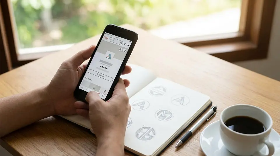
An Etsy shop icon is the small square image that stands in for your brand across Etsy, so it needs to read instantly, even when it’s shrunk down in feeds, receipts, and the app. Start with a simple mark or monogram, avoid taglines and thin details, and build in strong contrast so the shape stays clear on light and dark screens. Upload a clean 500 x 500 px square, keep the design centered with a little breathing room, and test it at tiny thumbnail size before you commit. The most common problem is forcing a full logo into the square and ending up with an unreadable blur that looks fine only at full size.
Etsy shop icon size requirements and file specs
Recommended pixel dimensions and aspect ratio
Etsy recommends a 500 x 500 px shop icon in a 1:1 square. That square matters because Etsy uses your icon in tight spaces, and anything that isn’t perfectly square can get auto-cropped in ways that feel unpredictable.
Even if your original logo is horizontal, don’t upload the full wide version and hope it shrinks nicely. Instead, create a dedicated square icon version. Keep your main symbol centered, with comfortable padding around it. If your design touches the edges, it’s more likely to feel cramped when Etsy scales it down.
For the most current image specs Etsy publishes, check Etsy’s own Requirements and Best Practices for Images in Your Etsy Shop.
Best file types and export settings
Etsy supports .JPG, .GIF, and .PNG files for shop images. One important catch: animated GIFs and transparent PNGs aren’t supported, and transparency can display as black. So if your logo relies on a transparent background, test it carefully. In many cases, a high-quality JPG with a solid background color is the safest option for an Etsy shop icon.
Export in sRGB for consistent color. Etsy may compress images to improve site performance, which can soften fine details. That’s another reason bold shapes and clean edges tend to outperform thin lines in a shop icon.
Where Etsy crops and displays your icon
Your shop icon shows at full size on your Shop Home, but it also appears much smaller across Etsy, including in activity feeds, receipts, and the Etsy app. That means your icon needs to survive aggressive downscaling.
Design for a “safe area” in the center. If you imagine your 500 x 500 icon with a small invisible margin, keep all critical elements inside that margin. This helps your icon stay readable even when it’s displayed as a tiny thumbnail.
Logo design rules that stay clear at tiny sizes
Bold shapes and high-contrast choices
At Etsy thumbnail size, your shop icon is basically a recognition stamp. Bold shapes win because they stay readable after downscaling and compression. If your logo has delicate strokes, fine texture, or thin outlines, it can break up into fuzz.
Aim for one clear silhouette. Then make contrast a deliberate choice:
- Dark mark on a light background, or light mark on a dark background.
- One main brand color plus a neutral (white, black, or a deep charcoal) usually reads best.
- If your brand palette is pastel, consider a slightly deeper version for the icon so it doesn’t wash out on bright screens.
A quick check: blur your icon slightly or zoom out until it’s about the size of a fingernail. If the shape still pops, you’re on the right track.
Simple layouts that read fast in a feed
People scroll fast on Etsy. Your icon has to communicate in less than a second. That’s why simple layouts outperform “full logo” layouts in a square.
A practical approach is to create a shop-icon variant that’s built for small spaces:
- Use just your symbol, or a single bold letter/monogram.
- Keep the focal point centered.
- Avoid borders that sit right on the edge. They often look uneven once scaled.
If your brand is product-driven, a clean symbol that matches what you sell (like a simplified leaf for plant-themed items) can be easier to remember than a complex badge.
When text in an icon fails
Text is the first thing to collapse at small sizes. Taglines almost never survive. Even your shop name can become unreadable unless it’s extremely short and set in a heavy, simple typeface.
If you want lettering, keep it minimal: one or two characters, high contrast, and plenty of spacing. Otherwise, let the icon be the visual cue, and rely on your shop name text (shown elsewhere on Etsy) to do the literal reading. This combination usually looks cleaner and more professional.
Etsy shop icon ideas that match your brand identity
Using your brand colors without losing contrast
Your Etsy shop icon should feel like your brand, but it also has a job to do: stay readable at tiny sizes. The easiest way to balance both is to lead with one “hero” brand color, then support it with a high-contrast background.
If your brand color is dark (navy, forest green, deep burgundy), try it as the icon mark on a clean white or warm off-white background. If your brand color is light (pastels, pale beige, light yellow), use it as a background and place a darker mark on top so the icon doesn’t fade into Etsy’s white UI.
A simple rule: if you convert your icon to grayscale and it still looks clear, your contrast is probably strong enough. If it turns into a mid-gray blob, adjust the background or darken the main color just for the icon version.
Choosing symbols that fit your products
The best Etsy shop icon ideas are specific, not generic. A symbol should connect to what you sell or what your style is known for, without being overly detailed. Think in “simple shape language,” not illustration.
Good symbol directions for Etsy shop icons include:
- A simplified product silhouette (candle, mug, charm, tote).
- A tool or material cue (needle, paintbrush, clay coil, wood grain line).
- A motif that matches your niche (starburst for boho jewelry, geometric tile for home decor).
If you’re stuck, start with your top-selling category and ask: “What would a customer instantly associate with this product?” Then reduce that idea to one clean, bold shape.
Keeping icon, banner, and photos cohesive
Your shop icon should match the rest of your Etsy storefront, especially your shop banner and listing photography. Cohesion builds trust because buyers feel like they’re in the right place when they click.
Keep these elements consistent across your Etsy branding:
- One repeating color or tone (bright and airy, dark and moody, warm neutrals).
- The same typography style (even if the icon itself doesn’t use text).
- Similar visual sharpness (minimal, clean edges vs. hand-drawn, textured look).
A helpful workflow is to treat your icon as the “avatar” for your shop, then use your banner and photos to provide the extra detail. The icon gets recognized; the rest confirms the vibe.
Mobile preview tips for your Etsy shop icon
Testing legibility on light and dark backgrounds
Most shoppers will see your Etsy shop icon on a phone, on a bright screen, often in quick scrolling moments. Test your icon on both light and dark backgrounds before you upload it.
Do a simple two-minute preview:
- Place your icon on a pure white background and a near-black background.
- Check if the main shape is still obvious at thumbnail size.
- Watch for “vanishing edges,” especially with pale colors on white or dark colors on black.
If your icon relies on a colored background, consider creating a thin internal margin (space between the background edge and the mark). That buffer helps the design feel clean on any screen.
Checking how it looks in search and recommendations
Your icon needs to work when it’s competing with dozens of other listings. The goal is not to look fancy, it’s to look instantly identifiable.
After you upload, look at it in the real Etsy interface:
- Visit your shop from the Etsy app and from a mobile browser.
- Search for a keyword you target and scan the results page.
- Tap into a few listing pages and see how your icon feels next to your shop name.
When an icon is working, you can recognize it without reading. If you keep losing it in the scroll, simplify the shape or increase contrast.
Avoiding blur and compression artifacts
Even with a 500 x 500 icon, Etsy may resize and compress the image. That can create blur, jagged edges, or muddy colors, especially around fine lines.
To keep your Etsy shop icon crisp:
- Export at the full recommended size (don’t upscale a smaller file).
- Avoid tiny text, thin outlines, and small interior gaps.
- Use clean, solid color areas instead of gradients or heavy texture.
- If you use PNG, flatten the background to a solid color so you don’t risk transparency issues.
If your icon still looks soft after upload, try thickening strokes, increasing spacing inside the mark, or simplifying to fewer shapes. Small adjustments usually make a big difference at thumbnail scale.
Common Etsy shop icon mistakes and quick fixes
Busy backgrounds and thin lines
A busy background is one of the fastest ways to make an Etsy shop icon look blurry. Texture, patterns, and photo backgrounds can look fine on a desktop, but they usually collapse on mobile.
Quick fixes that work well on Etsy:
- Swap the background for a single solid color (often white, black, or your brand’s main color).
- Thicken any outlines so they still show up when the icon is tiny.
- Remove shadows that create a “dirty” edge after compression.
If you really want texture, keep it extremely subtle and make sure the icon mark has a clean edge that stands out.
Too many details or too many colors
When an icon has lots of small elements, Etsy scaling turns it into visual noise. The same goes for using several bright colors in a small square. The eye doesn’t know where to land.
A practical approach is to reduce your icon to:
- One main symbol
- One main color plus one neutral
- One focal point
If your full logo is detailed, create an icon-specific version. Think of it like a social profile picture: it should be a simplified brand mark, not a complete brand system.
Off-center designs and awkward cropping
Even when your image is technically square, a design can feel off if the visual weight isn’t centered. This shows up as a logo that looks “pulled” to one side, or a mark that feels too close to the edge.
Quick fixes:
- Re-center the main shape visually (not just by the bounding box).
- Add consistent padding around the mark.
- Avoid placing important elements near the corners.
Before finalizing, take a screenshot of your icon at small size and compare it to a few established Etsy shops you like. If yours looks cramped or off-balance in that lineup, adjust the spacing and re-export.
Creating an Etsy shop icon with common design tools
Canva and Adobe Express sizing setup
In Canva or Adobe Express, start by creating a custom square canvas at 500 x 500 px. Build your design in the center and leave a little padding around the edges so it still looks good when Etsy displays it as a small thumbnail.
In Canva, choose Custom size, set the dimensions in pixels, then add your mark, monogram, or simple symbol. In Adobe Express, create a square graphic and set the size before you start arranging elements. Either way, keep effects minimal. Heavy shadows and tiny details tend to degrade after upload.
Before exporting, zoom out until the design is small on your screen. If it’s not instantly readable, simplify it.
Exporting sharp icons from Illustrator or Procreate
If you have access to Illustrator, it’s ideal for shop icons because vector artwork stays clean and exports sharply. Create an artboard at 500 x 500 px (or larger), keep strokes thick enough for small sizes, then export to a web-friendly format. If your design uses flat colors and crisp edges, PNG can look great, but remember Etsy does not support transparency reliably, so flatten onto a solid background color.
In Procreate, start with a square canvas and draw larger than you think you need. Tiny brush details that look charming at full size can vanish at thumbnail size. When you export, pick a high-quality setting and check the final file by viewing it small on your phone before you upload it to Etsy.
Template edits that still look original
Templates can speed things up, but the goal is a shop icon that feels like your brand, not something buyers have seen a hundred times. If you start from a template, change the structure, not just the text.
A few changes that make a template feel custom:
- Replace the default icon with a symbol tied to your products or materials.
- Adjust spacing and proportions so the mark has a unique silhouette.
- Use your real brand colors (then tweak for contrast if needed).
- Swap the font for something that matches your packaging or listing style, or remove text entirely for a cleaner icon.
The simplest way to stay original is to treat the template as a layout idea, then rebuild it with your own shapes and brand choices.
How do you know your shop icon is recognizable?
Simple recognition tests at multiple scales
100%, 50%, and 25% size comparisons
Recognizable means someone can spot your Etsy shop icon and connect it to your shop without effort. The easiest way to judge that is to test it at multiple sizes, because your icon will rarely be seen “full size” in real Etsy browsing.
Start with a simple three-scale check:
-
100% (full file view)
Open the exported icon at normal size. Confirm edges look clean, the background is intentional (not transparent), and nothing important is too close to the border. -
50% (quick scroll size)
Shrink it to half size on your screen. At this point, small flaws show up fast. If the design starts to feel cramped, add padding. If lines start to break, thicken them. -
25% (thumbnail reality check)
Shrink it again to about a quarter of the original. This is close to how it can feel in Etsy’s app and in busy browsing moments. If you can’t tell what it is in one second, simplify the symbol, increase contrast, or remove extra shapes.
To make the test more realistic, place your icon next to 6 to 10 other icons in a grid (even a quick mockup screenshot works). Your goal is not to be the loudest. It’s to be distinct. If your icon blends in, try one strong change: a bolder silhouette, a cleaner background, or a more defined light-vs-dark contrast.
Related posts
Keep reading
Etsy Featured Listings: How to Curate Your Shop Homepage
Etsy featured listings help spotlight bestsellers on your Shop Home; pick 4 (or sections), order them for cohesive photos, and rotate a queued set for seasons.

Selling Jewelry on Etsy: Metal Disclosure and Allergy Considerations
Selling jewelry on Etsy: List exact metals, flag nickel sensitivity, and support hypoallergenic wording with supplier docs or testing to reduce buyer issues.
How to Use Etsy “Materials” and “Occasion” Fields Strategically
Etsy Materials and Occasion fields can boost visibility when chosen for buyer filters; match category, avoid guesswork, and align tags with real intent.

Etsy SEO Tips to Rank Higher in Search
Happy Etsy SEO tips for sellers: master keywords, titles, tags, photos, reviews, free shipping, and conversions to rank higher in Etsy search and boost sales.

Etsy Pattern vs a Standalone Website: Which One Fits an Etsy Seller?
Etsy Pattern vs standalone website: compare costs, control, SEO, customer emails, and integrations to decide when to stay synced with Etsy or go independent.
Etsy Shop Banner Guide: Sizes, Safe Areas, and Design Tips
Etsy shop banner size and safe-area quick checklist for mini, big, carousel, and collage headers, plus mobile cropping, file specs, and clean design tips.