How to Use FAQ Images in Etsy Listings to Reduce Questions

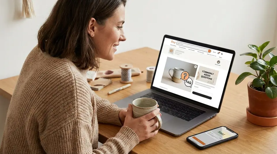
FAQ images are simple graphic slides you add to your Etsy photo stack to answer common buyer questions before they hit “Message seller.” Done well, they set clear expectations fast, especially on mobile, by spelling out essentials like dimensions, materials, how personalization works, processing time, and what’s included in the order. Keep your first photo clean and product-focused, then place these info slides after your best lifestyle and detail shots, using large text, high contrast, and one topic per image so nothing gets missed. The surprising part is how often a single vague line about sizing or customization creates more confusion than no FAQ at all.
Buyer questions to solve with image-based micro FAQs
Sizing, materials, and fit clarifiers
Sizing confusion is one of the biggest drivers of “Just checking…” messages on Etsy. Use a micro FAQ image to make sizing unmissable at a glance.
Include the specifics buyers use to decide fast: exact dimensions in inches and centimeters, thickness/depth, and anything that changes the footprint (like a frame, clasp, or handle). If fit matters, state the range clearly (for example, “Fits wrist sizes 6 to 7.5 in”). For apparel, add the key measurement points you use (chest, length, inseam), not just S-M-L.
For materials, keep it simple and direct. List the primary material, the finish, and any common concern like “nickel-free,” “water-resistant,” or “natural wood grain varies.” One short line about expected variation prevents a lot of disappointment later.
Customization and personalization prompts
If you offer custom options, your FAQ image should tell buyers exactly what you need from them and where they will enter it. Spell out the required fields (name, date, font choice) and show one clean example of correct formatting.
A helpful approach is: “Personalization box: paste text exactly like this,” plus a second line for any limits (character count, emojis not supported, capitalization rules). If you use Etsy’s personalization feature, keep it aligned with how Etsy collects buyer details in the listing flow. How to Offer Personalized Listings is a good reference for setting that up cleanly.
Shipping, processing time, and returns callouts
Buyers often mix up “processing time” with “shipping time.” Your micro FAQ image should separate them in plain language and set expectations for when the order ships. If you sell made-to-order items, say that clearly, then give your typical processing range and what can extend it (custom proof approval, holiday volume).
If you want fewer “Will this arrive by Friday?” messages, add one line that points buyers to Etsy’s “ship by” date and estimated delivery window, and make sure your processing settings match what you can actually do. Etsy’s guidance on processing times and ship-by dates helps you keep those promises consistent.
For returns, keep it buyer-friendly and firm: whether you accept returns, the time window, and the key exception (for example, “Custom items: no returns unless damaged”).
Designing FAQ images that stay readable on Etsy thumbnails
Text size, contrast, and safe margins
Your FAQ image only works if someone can read it in a quick scroll. Design for the smallest view first: the thumbnail and the first tap on mobile.
Use short lines and big type. If you have to squint at 100 percent zoom on your phone, buyers will skip it. Aim for a clear hierarchy: one bold headline (the question), then 1 to 3 short answer lines.
Contrast matters more than fancy fonts. Dark text on a light solid background (or the reverse) is the safest choice. Avoid patterned backgrounds and low-contrast pastels that look fine on a desktop monitor but blur on mobile.
Also leave generous safe margins. Etsy crops images differently across placements, and tight edge-to-edge text is the first thing to get cut off. Keep all text and important icons comfortably away from the edges, and avoid placing critical words in corners.
Consistent layouts across the image set
Consistency makes your listing feel trustworthy. It also helps buyers “learn” your slide style after the first one.
Pick one template and stick to it: same background, same font pair, same headline position, same icon style, and the same spacing rules. When every slide looks different, buyers spend their attention decoding the design instead of absorbing the answer.
A simple, repeatable structure works well:
- Top: question headline
- Middle: short answer
- Bottom: one supporting detail (like a measurement note or turnaround range)
When to use icons vs text
Icons are great for scanning, but they are not great at carrying nuance. Use icons to label categories quickly (ruler for size, paintbrush for customization, truck for shipping), then let text deliver the actual answer.
If a detail can cause a mistake, write it out. Character limits, sizing ranges, “made to order,” and return exceptions should be text-first. Treat icons as signposts, not the message.
Recommended FAQ image dimensions, cropping, and quality tips
Avoiding blurry text after Etsy compression
FAQ images are text-heavy, so compression is your enemy. Start with larger files so Etsy has enough detail to work with. Etsy recommends listing images be at least 2000 pixels wide and 2000 pixels tall (or more), which gives your text a better chance of staying crisp after upload. Keep your text bold, avoid thin strokes, and stick to clean sans-serif fonts.
Export in sRGB color so your whites stay white and your blacks stay black. And if uploads are failing, try reducing file size. Etsy notes that images over 1MB may have trouble uploading on slower connections. The full checklist is in Etsy’s Requirements and Best Practices for Images in Your Etsy Shop.
Mobile-first crops for key details
Design your FAQ card so the headline and the answer survive cropping. Put the main question at the top center, then the short answer in the middle. Leave comfortable padding around all edges so nothing gets clipped in thumbnails.
A practical test: zoom your FAQ image out until it is about the size of an Etsy search thumbnail on your phone. If you cannot read it instantly, cut words, increase font size, or split the content into two FAQ slides.
Using square vs landscape for FAQ cards
Square FAQ cards are usually the easiest for readability because they keep text larger in a cropped preview. Landscape (horizontal) cards can work well for “two-column” info like size on the left and materials on the right, but only if you keep text large and centered.
Whatever you choose, stay consistent within the listing. Mixed shapes can cause awkward crops and make your FAQ slides harder to follow.
Where to place FAQ images in your listing photo order
First photo vs supporting FAQ slides
Your first Etsy photo should sell the product, not explain it. Lead with a clean, bright hero shot that shows the item clearly and matches what the buyer will receive. This builds trust and earns the click.
Then use FAQ images as supporting slides. A good rule is to place the first FAQ card after your strongest product photos: a hero image, one lifestyle shot (if relevant), and one close-up that proves quality. By that point, the shopper is interested and more willing to read details like sizing, processing time, or how personalization works.
If a single detail is a dealbreaker for most buyers, it can move earlier. Examples include “digital download only,” “made to order,” or “set of 2.” In those cases, an early micro FAQ slide can prevent refunds and frustrated messages.
Grouping related FAQs into a sequence
FAQ slides work best when they feel like a mini story, not random interruptions. Group them by topic and keep each card focused on one question.
A simple sequence that reduces repeat questions is:
- Size and what’s included
- Materials and care
- Customization steps (if offered)
- Processing time and shipping basics
- Returns or policies that matter most
This order mirrors how buyers decide. First they confirm it fits, then they check quality, then they confirm timing.
Keeping the last image as a recap
Your last listing image is a great place for a friendly recap. Think of it as the “final reassurance” slide for someone who swiped through quickly and wants to double-check the basics.
Keep it short: 3 to 5 bullets max. Include the biggest question reducers like size range, processing time range, customization instructions, and one clear note about what’s included. Avoid adding new information here. The recap should reinforce what you already stated, so buyers feel confident, not surprised.
Image descriptions and accessibility for FAQ-style listing images
Writing clear image descriptions that match on-image text
FAQ images should help every buyer, including people who use screen readers. On Etsy, you can add a text alternative (alt text) to each listing photo. It does not show on the listing visually, but it gives an accessible description of what’s in the image.
For FAQ-style listing images, the best approach is simple: mirror the on-image message, then add a little context. If your FAQ card says “Sizing: 8 x 10 in (20 x 25 cm), frame not included,” your alt text should communicate the same facts in one clean sentence. Keep it plain and specific. Skip keyword stuffing. Etsy notes that alt text is meant to describe the image for someone who can’t see it, and it has a 250-character limit. Text alternative (alt text) is the official how-to.
Screen-reader friendly sequencing and wording
Treat your listing photos like a sequence that should make sense when read aloud. That means your FAQ images should not rely on “as shown above” or “see photo 3.” Instead, restate the key detail inside the alt text.
Use consistent wording across the set. If you call it “processing time” on one card, don’t switch to “production time” on another. For variations, name the option the way it appears in Etsy (like “Color: Walnut” or “Size: Large”) so the buyer can match what they hear to what they click.
Also, avoid packing multiple FAQs into one slide. One topic per image makes the on-screen text easier to read and the alt text easier to understand.
Testing your listing with a quick accessibility pass
Before publishing, do a fast check:
- On your phone, swipe through the photos quickly. Confirm each FAQ is readable in two seconds.
- Reopen the listing in Shop Manager and check that each FAQ image has alt text filled in.
- Read the alt text out loud. If it sounds confusing, too long, or repetitive, rewrite it into one clear sentence that matches the on-image text.
Linking photos to variations and measuring which FAQs reduce messages
Variation-linked photos that answer option questions
If buyers keep asking “What does the walnut look like?” or “Is the Large bigger or longer?”, link the right photo to the right option. Etsy lets you connect listing photos to a visible variation (like color), so the image updates when a shopper selects that option.
This is perfect for FAQ-style clarity. You can create one variation photo that includes the product plus a small, readable label like “Color: Sage” or “Size: 11 oz.” Keep it honest and simple. Don’t use a variation-linked image to hide important limitations. Use it to confirm what the buyer is choosing.
Etsy’s help doc on How to Add Variations for Your Listings walks through linking photos to a variation, including the “Link photos” toggle in the listing editor.
Using listing stats and message tags to spot gaps
To see if your FAQ images are working, look for two signals:
- Fewer repeat questions in Messages about the same topic (size, personalization, shipping).
- Better listing engagement over time (more favorites, higher conversion, fewer abandoned conversations).
Inside Etsy Messages, use labels to categorize what people ask. Create labels like “Sizing,” “Personalization,” “Shipping,” and “Returns.” Apply one label to each new question for a couple of weeks. Patterns show up fast, and they tell you which FAQ slides to add or rewrite.
Refreshing and A/B testing FAQ slides without breaking trust
Change one thing at a time. Swap a single FAQ slide, then watch messages for that topic for at least a week or two (longer if you have low traffic).
Keep trust intact by staying consistent across your listing. If you update an FAQ image, make sure the same details match your variations, description, and processing settings. Buyers get uneasy when the photos say one thing and the listing details say another.
Related posts
Keep reading
How to Add Credentials and Experience to Etsy Listings (Without Overclaiming)
Etsy listing descriptions that signal expertise: add certifications, process details, and honest experience notes while avoiding risky medical or legal claims.
How to Set Up SKU Numbers for Etsy Listings (Beginner-Friendly Guide)
Etsy SKU numbers made simple: add them in Inventory and Pricing, set SKUs for variations, and pick a clear 4-8 character system to track stock fast every day.
How to Build a Size Guide for Etsy Listings (Examples)
Size guide for Etsy listings with clear measurement tables, photo-ready charts, and examples for apparel and prints to cut buyer sizing questions and returns.

Why Your Etsy Listings Get Views but No Sales
Turn your Etsy views into steady sales with better keywords, pricing, photos, and conversion-focused listing tweaks that build trust and boost shop revenue.
How to Protect Digital Files From Theft on Etsy
Protect Etsy digital downloads from theft with smart watermarks, secure file delivery, licenses, DMCA takedowns, and piracy monitoring to safeguard your profits.
How to Answer Etsy Messages Faster With Saved Replies (Templates)
Etsy saved replies help you answer buyers in seconds: create snippets for shipping, customs, and order updates, add placeholders, and stay Star Seller-ready.