

General
Psychological Pricing Strategies for Etsy
Boost Etsy sales with joyful psychological pricing tips—charm prices, anchoring, bundles, urgency and value cues tailored to handmade, digital and craft shops.
I sell digital downloads on Etsy and I’m updating my listing photos to look clearer and more consistent. I’m not sure what canvas size or aspect ratio performs best for Etsy, especially when the thumbnails get cropped in search and when shoppers are browsing on mobile.
Is it better to design listing images in a square format, portrait, or landscape so they display well in search results and keep any text readable at small sizes? Also, should I create one master template and resize it, or design images specifically for Etsy from the start?
Hi! For Etsy digital download listing photos, the safest “works everywhere” choice is a landscape 4:3 aspect ratio (for example 3000 × 2250 px or anything where the short side is at least ~2000 px) and then designing with a center “safe area” so your thumbnail still looks good when Etsy crops it to a square in places like search/shop grids—especially on mobile.
A few practical rules that keep thumbnails from cutting off important stuff (and keep text readable):
On square vs portrait vs landscape:
For your workflow: make one master template and export versions rather than designing from scratch each time.
If you tell me what kind of digital downloads you sell (wall art, Canva templates, planners, SVGs, etc.), I can suggest a simple photo sequence (what to put in image #1, #2, #3…) that tends to keep text readable and conversions strong on mobile.
Related questions
I sell digital downloads on Etsy and a buyer paid $6 for a $5 item, but the tax line is $0. What else could cause this, and can buyers add extra at checkout?
I shipped an Etsy international order via USPS, but tracking has been stuck for weeks after acceptance. What can I do, and when should I refund or replace?
My Etsy order tracking shows delivered, but the buyer says it wasn’t received. What should I do next to handle a refund, replacement, or claim?
I run an Etsy shop and a buyer wants a refund after the order shipped because they found a cheaper option. What’s the standard Etsy approach?
I sell physical products on Etsy and I’m debating whether free shipping or charging shipping separately leads to better conversions and pricing strategy.
I run an Etsy shop and I’m getting lots of Etsy views and visits but only one order. What’s the difference, and how can I improve conversions?
Related posts
Boost Etsy sales with joyful psychological pricing tips—charm prices, anchoring, bundles, urgency and value cues tailored to handmade, digital and craft shops.
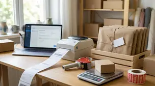
Streamline batch shipping on Etsy with a simple system that saves time, cuts postage costs, automates labels, and boosts order accuracy for happy repeat buyers.

Happy Etsy SEO tips for sellers: master keywords, titles, tags, photos, reviews, free shipping, and conversions to rank higher in Etsy search and boost sales.

Discover how long it really takes to make money on Etsy, with realistic timelines, proven shop-setup tips, SEO keywords, and fast first-sale strategies.

Learn how to cancel an Etsy order as a seller step‑by‑step, issue full or partial refunds, avoid policy violations, and keep buyers happy with clear communication.

Holiday shipping deadlines guide for Etsy sellers with USPS, UPS, FedEx cutoff dates, processing times, packaging tips, and planning strategies to avoid late deliveries.