

General
Psychological Pricing Strategies for Etsy
Boost Etsy sales with joyful psychological pricing tips—charm prices, anchoring, bundles, urgency and value cues tailored to handmade, digital and craft shops.
I run an Etsy shop and I’m trying to align upcoming listings and photos with Etsy’s 2026 Color of the Year for trend-based keywords and merchandising.
When I look at Etsy’s announcements, the example product photos don’t seem to match each other—one set reads more teal/green to me, while another looks much more blue. I’m not sure what exact shade Etsy intends sellers to use.
Is there an official color reference (name, hex code, or description) for Etsy’s 2026 Color of the Year, and how should sellers interpret it when choosing colors and editing listing photos?
Hi! Etsy’s 2026 Color of the Year is Patina Blue—a blue‑green shade inspired by the weathered “patina” you see on aged copper. As of Etsy’s official announcement (Dec 10, 2025), Etsy describes the color and the vibe, but they don’t publish an official seller-facing color spec like a hex code, Pantone number, or RGB value, so you shouldn’t feel like you’re missing “the one correct” shade.
What you’re noticing in the announcement images (some reading greener/teal vs. others reading bluer) is normal, and it usually comes down to a few things:
If you want a practical way to use this for Etsy SEO + merchandising (without chasing a nonexistent hex code), here’s what tends to work best:
How to interpret “Patina Blue” as a seller
How to keyword it (without being misleading)
Use “patina blue” when it genuinely fits, and support it with close-match phrases shoppers already search:
How to edit listing photos so it looks consistent
If you tell me what you sell (jewelry, home decor, apparel, digital prints, etc.) and whether Patina Blue is your product color or just your styling theme, I can suggest a couple of tight tag/title combos that usually read well for Etsy search.
Related questions
I sell digital downloads on Etsy and a buyer paid $6 for a $5 item, but the tax line is $0. What else could cause this, and can buyers add extra at checkout?
I shipped an Etsy international order via USPS, but tracking has been stuck for weeks after acceptance. What can I do, and when should I refund or replace?
My Etsy order tracking shows delivered, but the buyer says it wasn’t received. What should I do next to handle a refund, replacement, or claim?
I run an Etsy shop and a buyer wants a refund after the order shipped because they found a cheaper option. What’s the standard Etsy approach?
I’m considering selling French-language digital downloads on Etsy and want to know demand, conversion vs English, international buyers, and SEO/Ads/refund issues.
I sell on Etsy and want consistent listing photo thumbnails without awkward cropping or extra space in search and my shop. What image size and framing works best?
Related posts
Boost Etsy sales with joyful psychological pricing tips—charm prices, anchoring, bundles, urgency and value cues tailored to handmade, digital and craft shops.
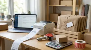
Streamline batch shipping on Etsy with a simple system that saves time, cuts postage costs, automates labels, and boosts order accuracy for happy repeat buyers.

Happy Etsy SEO tips for sellers: master keywords, titles, tags, photos, reviews, free shipping, and conversions to rank higher in Etsy search and boost sales.
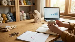
Discover how long it really takes to make money on Etsy, with realistic timelines, proven shop-setup tips, SEO keywords, and fast first-sale strategies.

Discover if free shipping on Etsy fits your handmade shop, weighing search boost, conversion rates, profit margins, product pricing, and buyer expectations.
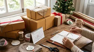
Holiday shipping deadlines guide for Etsy sellers with USPS, UPS, FedEx cutoff dates, processing times, packaging tips, and planning strategies to avoid late deliveries.