

General
Psychological Pricing Strategies for Etsy
Boost Etsy sales with joyful psychological pricing tips—charm prices, anchoring, bundles, urgency and value cues tailored to handmade, digital and craft shops.
I sell items where color accuracy matters, and I’ve been looking at Etsy’s 2026 Color of the Year announcements to see how to align my photos and listings.
The examples shown in the different announcement pages don’t look consistent to me—one set of product images reads more like teal/green-blue, while the other looks much more blue. I’m not sure if this is intentional, a lighting/editing difference, or if there’s an official color definition I should be following.
Does Etsy publish a specific color reference (name, hex code, or similar) for the 2026 Color of the Year, and how should sellers interpret it when styling products and listing photos?
Hi! Etsy’s 2026 Color of the Year is Patina Blue (announced December 10, 2025), and it’s intentionally a blue‑green “oxidized copper” / patina vibe—so if one page reads more teal and another reads more blue, that’s very likely just photography, lighting, and editing differences, not you missing a “correct” version.
As of now, Etsy’s own announcement materials describe the shade and show examples, but they don’t publish a single official seller-facing color specification (like a required hex code, Pantone number, RGB/CMYK, etc.) that you’re supposed to match exactly. So there isn’t one “official” numeric reference you can rely on for perfect consistency across screens.
If color accuracy matters for your products, here’s the safest way to interpret/use Patina Blue in your Etsy listing photos and styling:
For SEO and clarity, I’d also label it as “patina blue” + “blue‑green” in your Etsy listing title/description/tags (instead of only “blue”), so shoppers who see it as teal still feel like they found the right thing.
Related questions
I sell digital downloads on Etsy and a buyer paid $6 for a $5 item, but the tax line is $0. What else could cause this, and can buyers add extra at checkout?
I shipped an Etsy international order via USPS, but tracking has been stuck for weeks after acceptance. What can I do, and when should I refund or replace?
My Etsy order tracking shows delivered, but the buyer says it wasn’t received. What should I do next to handle a refund, replacement, or claim?
I run an Etsy shop and a buyer wants a refund after the order shipped because they found a cheaper option. What’s the standard Etsy approach?
I run an Etsy shop in California and can’t use my apartment for a city business license. Is a virtual office legitimate, and do I need a seller’s permit too?
I sell cute pastel floral apparel on Etsy and want to add a very different style. Will mixing niches hurt Etsy SEO/visibility, or should I open a second shop?
Related posts
Boost Etsy sales with joyful psychological pricing tips—charm prices, anchoring, bundles, urgency and value cues tailored to handmade, digital and craft shops.
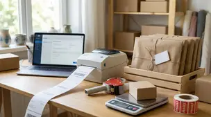
Streamline batch shipping on Etsy with a simple system that saves time, cuts postage costs, automates labels, and boosts order accuracy for happy repeat buyers.

Happy Etsy SEO tips for sellers: master keywords, titles, tags, photos, reviews, free shipping, and conversions to rank higher in Etsy search and boost sales.

Discover how long it really takes to make money on Etsy, with realistic timelines, proven shop-setup tips, SEO keywords, and fast first-sale strategies.

Lost Etsy package? Stay calm and delight buyers with clear communication, carrier claims, Etsy Purchase Protection, smart refunds, and proactive shipping safeguards.
Holiday shipping deadlines guide for Etsy sellers with USPS, UPS, FedEx cutoff dates, processing times, packaging tips, and planning strategies to avoid late deliveries.