
General
How to Use FAQ Images in Etsy Listings to Reduce Questions
Etsy FAQ images that answer shipping, sizing, and customization upfront, with readable mobile-friendly design, order, and wording tips to cut repeat messages.
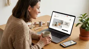
I run an Etsy shop selling downloadable nutrition printables and client handouts created by a credentialed dietitian. The products focus on practical, inclusive guidance for specific conditions (for example digestive issues, blood sugar support, heart health, and hormone-related concerns), and I’ve been steadily adding new listings.
Sales have been slow recently, and I’m trying to figure out whether the issue is my listing presentation or the market itself. Are my cover images and titles clear and clickable without feeling overly stuffed with keywords, and what types of paid nutrition resources do customers actually find worth buying instead of using free information online? Also, is a niche, expert-led nutrition printable shop realistically viable on Etsy right now?
Hi! Your niche can be viable on Etsy right now, but slow sales usually come from a mismatch between (1) what shoppers are actually searching, (2) how instantly understandable your first photo/title is in search results, and (3) whether the product feels “more actionable than free info.” The good news: a credentialed, inclusive, condition-specific angle is a real differentiator—you just have to package it in a way that reads like an immediate solution, not “general nutrition education.”
If you want truly specific feedback on your titles and cover images, paste 2–3 listing titles here plus the exact text you use on the first image (or upload screenshots of your search thumbnails). I’ll tell you what I’d tighten for clickability and Etsy SEO.
People don’t usually pay for nutrition “information.” They pay for structure, clarity, and reduced decision fatigue—especially when they’re stressed, symptomatic, or newly diagnosed.
The paid nutrition resources that tend to feel worth buying on Etsy are:
A quick gut-check: if a buyer sees your thumbnail for 1 second, can they tell who it’s for and what it helps them do this week?
A strong Etsy listing title usually works best as:
Primary phrase (human-readable) + specific audience/goal + format/usage
Example pattern (you can adapt):
“Blood Sugar Support Grocery List Printable, Balanced Snack Ideas, Dietitian-Made PDF Instant Download”
That’s readable, not spammy, and still keyword-rich.
Tips that move the needle:
Most nutrition printable thumbnails fail because they’re either too text-heavy or too generic. Your first image should answer, fast:
What usually works best:
If your first image has more than ~8–10 words, it’s often too much for Etsy search.
For digital downloads, Etsy is competitive, but a niche expert shop can absolutely work if you lean into specific search intent and bundle/value. Signs it’s presentation/positioning (not “Etsy is dead”):
If you reply with a couple listing examples (title + what your first image says + price range), I’ll help you rewrite one title, suggest tag angles to test, and give you 2–3 cover-image layouts that tend to convert for nutrition printables.
Related questions
I sell digital downloads on Etsy and want to know if my Etsy SEO changes are improving search visibility, and whether more listings boosts exposure.
I sell handmade products on Etsy and I’m considering asking buyers for photos. Is it appropriate, and how do I get permission to use them in listing images?
I’m a new Etsy seller trying to learn Etsy SEO and understand how keywords, titles, tags, and categories work together to get found in search.
I’m a California Etsy seller trying to file a CDTFA sales tax return with under $300 in Etsy sales, and I’m unsure what to report and which totals to use.
I’m buying Etsy shipping labels and the buyer’s apartment/unit on address line 2 is showing up twice on the label—how can I prevent this?
I run an Etsy shop in Canada and want to switch to Chit Chats. How should I set flat Etsy shipping rates for Canada, US, and international orders?
Related posts
Etsy FAQ images that answer shipping, sizing, and customization upfront, with readable mobile-friendly design, order, and wording tips to cut repeat messages.
Discover exactly what you can sell on Etsy—from handmade crafts and digital downloads to vintage treasures and craft supplies—and start growing a joyful shop today.

Happy Etsy SEO tips for sellers: master keywords, titles, tags, photos, reviews, free shipping, and conversions to rank higher in Etsy search and boost sales.

Notion for Etsy sellers: organize tasks, listing tweaks and notes in one place, with database views for today and this week plus an ideas inbox, at a glance.

Product spec sheets for Etsy items record SKUs, materials, measurements, photos, packaging, and QC checkpoints so reorders reliably match what customers expect.
Business cards for Etsy sellers: smart basics like shop link or QR code, logo, and socials, with cardstock tips and pitfalls like clutter and pushy review asks.