

General
How Many Photos Should an Etsy Listing Have?
Discover exactly how many photos your Etsy listing really needs, with winning examples and photo ideas to boost clicks, buyer trust, and sales.
I’m helping set up an Etsy shop that sells handmade miniature dollhouse accessories made from wood, clay, and epoxy resin. I’m unsure what style of main listing photo performs best.
We can use a simple, clean product photo shot in a light box, or a styled “in-scene” image that adds background context to show scale and how it could be used (the product itself isn’t altered, only the setting is created digitally).
For Etsy search and ads, is a plain product photo usually better as the first image, or do styled context photos tend to get more clicks and views?
Hi! The first Etsy listing photo is hugely important for miniature dollhouse accessories because it’s doing two jobs at once in a tiny thumbnail: it has to clearly show what you’re selling and instantly communicate the scale (otherwise shoppers scroll past or click and bounce). In most cases, the best-performing “main photo” is a clean, high-contrast hero shot where the item fills the frame—but for miniatures, adding a little real-world context for scale often boosts clicks because it removes uncertainty.
If you’re choosing between “plain light box” vs “styled in-scene,” here’s the practical rule of thumb for Etsy search + Etsy Ads:
For your niche specifically (dollhouse miniatures), a styled photo can absolutely win clicks when it still reads clearly as the product at thumbnail size. The risk is that elaborate backgrounds (especially digitally created scenes) can make the item look smaller, harder to identify, or leave shoppers unsure what’s actually included—leading to lower conversion even if clicks go up.
A strong approach I see work well for miniatures:
One more important note: if you’re creating the setting digitally, keep it honest—don’t change the product’s appearance, size, color, or finish, and don’t imply accessories are included if they aren’t. Etsy shoppers are quick to report “not as described” when a thumbnail feels like a promise.
If you want the quickest way to know what works for your shop: run the same product with two photo styles over time (or swap the main photo every 1–2 weeks) and watch Etsy Ads performance plus conversion (clicks are good, but purchases are the real winner). For miniatures, the “winner” is often the photo that makes scale obvious while still looking premium and scroll-stopping.
Related questions
I run an Etsy shop and want to know if adding alt text to listing photos improves Etsy SEO, search ranking, or sales enough to be worth the time.
I sell physical products on Etsy and buyers worry about customs/VAT or carrier fees. Should I repeat import duty info in listing photos, and how?
I sell handmade products on Etsy and I’m considering asking buyers for photos. Is it appropriate, and how do I get permission to use them in listing images?
I run an Etsy shop from Japan and get paid in USD while most expenses are in JPY. How can I track profit and exchange rates consistently?
My handmade Etsy listing was wrongly deactivated as mass-produced. What does Etsy need to review, and what info should I provide to get it reinstated?
I run an Etsy shop selling digital planners and other digital downloads, but after daily listings, SEO, and ads I still get few sales—why and how to troubleshoot favorites without conversions?
Related posts
Discover exactly how many photos your Etsy listing really needs, with winning examples and photo ideas to boost clicks, buyer trust, and sales.

Revive dead Etsy listings with smart SEO, renewal timing, fresh photos and keywords that boost traffic, restore visibility and get your shop selling again.

Learn how to create private Etsy custom listings step by step, reserve items for one buyer only, manage custom orders, protect pricing, and boost shop sales.

Discover if free shipping on Etsy fits your handmade shop, weighing search boost, conversion rates, profit margins, product pricing, and buyer expectations.
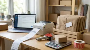
Streamline batch shipping on Etsy with a simple system that saves time, cuts postage costs, automates labels, and boosts order accuracy for happy repeat buyers.
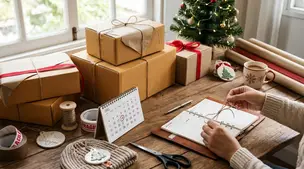
Holiday shipping deadlines guide for Etsy sellers with USPS, UPS, FedEx cutoff dates, processing times, packaging tips, and planning strategies to avoid late deliveries.