

General
How to Protect Your Etsy Shop From Scams and Phishing
Etsy phishing scams: spot fake support messages, QR-code traps, and off-platform payment requests, then lock down your account with 2FA and spam reporting.

I run an Etsy shop selling adult-themed digital plans and related items, and my branding has become inconsistent over time. I started with a playful, cute logo style, but as I added more mature products I shifted toward a darker, more “serious” look—now my shop feels mixed and unclear.
I’m planning a refresh before adding new listings soon, and I also need to redo my listing images because Etsy’s image cropping makes my current graphics look messy. Should I lean into a light, goofy/cute brand voice in this niche, or is it better to use more standard adult-product branding so customers immediately understand what I sell? And what’s the best way to create listing photo collages for digital plans so they still read clearly across Etsy’s different crop ratios?
Hi! I’d aim for one clear “lane” that fits both your older cute vibe and your newer mature products—something like playfully sexy but polished—rather than swinging fully goofy/cute or fully dark/serious. In adult-themed niches on Etsy, customers mainly want (1) instant clarity on what the digital plan is, and (2) confidence it’s tasteful/legit, so a consistent, clean brand system (colors, fonts, tone) matters more than whether it’s “cute” or “standard adult” branding.
A simple way to rebrand without throwing everything away:
One important caution: keep your listing photos and thumbnails compliant and “safe for marketplace browsing.” Etsy allows some mature content, but they’re picky about how it’s shown—avoid explicit/graphic imagery in your main photos, and use more suggestive/illustrative visuals and clear text instead. If any listing needs mature labeling, do that correctly so you don’t risk visibility or removal.
Etsy displays your first photo in multiple crops across the site/app, so the goal is to design for a center “safe zone.” Here’s what works best for digital plan collages:
A collage formula that usually stays readable:
If you tell me what your “digital plans” are used for (party games? bedroom prompts? roleplay planners? etc.) and whether you want to feel more “cute cheeky” or “luxury discreet,” I can suggest a tight brand direction (palette + font style + image layout) that fits your niche and won’t fight Etsy cropping.
Related questions
I want to open an Etsy shop for AI-generated art and print-on-demand products, and I need practical steps on rules, setup, listings, SEO, and income.
I sell handmade art on Etsy and want to add digital cross stitch/needlepoint patterns. Should I list them in my existing shop or open a separate pattern shop?
I found an Etsy shop that may be reselling mass-produced items and using car brand imagery. How do I report listings for misrepresentation or IP infringement?
My Etsy shop “All Time” stats by month look shifted by one month. Is this a normal Etsy Stats delay/timezone issue, and how can I confirm the correct month?
I’m trying to set up an email marketing engagement scoring model for opens and clicks, including recency weighting and thresholds for engaged vs inactive subscribers.
I’m restarting my Etsy shop for handmade sculpted decor and I’m seeing more 3D-printed and mass-produced items. Is Etsy still good in 2026?
Related posts
Etsy phishing scams: spot fake support messages, QR-code traps, and off-platform payment requests, then lock down your account with 2FA and spam reporting.

Learn how to set up Google Analytics 4 for your Etsy shop step by step to track traffic, buyer behavior, keywords, sales funnels, and marketing performance.
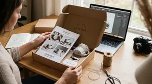
Etsy press kit checklist: brand story, high-res product photos, logos, pricing, shop links, and contacts so journalists and bloggers feature your work fast.
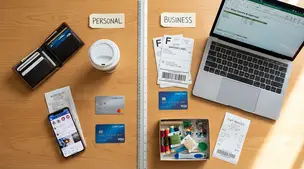
Separate personal and business finances by using a dedicated bank account and card, tracking Etsy fees and payouts, and keeping clean, tax-ready records.

Learn how to cancel an Etsy order as a seller step‑by‑step, issue full or partial refunds, avoid policy violations, and keep buyers happy with clear communication.

TikTok for Etsy sellers: 30 practical post prompts with quick hooks, studio shots, making and packing orders, product benefits, CTAs, and hashtags for your shop.