
General
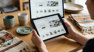
Etsy Featured Listings: How to Curate Your Shop Homepage
Etsy featured listings help spotlight bestsellers on your Shop Home; pick 4 (or sections), order them for cohesive photos, and rotate a queued set for seasons.
I sell an item that comes in multiple color variations. I have one strong product photo that shows the item clearly, but it only shows one color, and I also have a group photo that shows several colors but isn’t as clear as the single shot.
For an Etsy listing with multiple color options, is it better to use the clearer single photo or the multi-color group photo as the main thumbnail to get more clicks and set the right expectations?
Hi! In most cases, use the clearer single-color photo as your main thumbnail—Etsy shoppers decide in a split second, and the sharpest, most readable image usually wins clicks. You can still set expectations about multiple colors by using your second (or third) photo to show the full color lineup and by making your variation selector and first line of the description super obvious.
If you’re deciding which to pick, here’s the practical rule of thumb:
A good compromise that works really well on Etsy:
One more tip: whatever you choose, make sure a shopper can tell within the first 2–3 photos exactly what they’re buying (one item vs set), and how the color choice works. That’s what reduces disappointed messages and “item not as expected” vibes while still maximizing clicks.
Related questions
I sell digital downloads on Etsy and a buyer paid $6 for a $5 item, but the tax line is $0. What else could cause this, and can buyers add extra at checkout?
I shipped an Etsy international order via USPS, but tracking has been stuck for weeks after acceptance. What can I do, and when should I refund or replace?
My Etsy order tracking shows delivered, but the buyer says it wasn’t received. What should I do next to handle a refund, replacement, or claim?
I run an Etsy shop and a buyer wants a refund after the order shipped because they found a cheaper option. What’s the standard Etsy approach?
When buying an Etsy shipping label, Etsy says my return address is “unconfirmed” even though it hasn’t changed. Is this a bug or USPS validation issue?
I just opened a new Etsy shop and I’m only getting a couple views per day. Besides Etsy SEO, what should I focus on to get consistent views?
Related posts
Etsy featured listings help spotlight bestsellers on your Shop Home; pick 4 (or sections), order them for cohesive photos, and rotate a queued set for seasons.

Selling jewelry on Etsy: List exact metals, flag nickel sensitivity, and support hypoallergenic wording with supplier docs or testing to reduce buyer issues.

Etsy Materials and Occasion fields can boost visibility when chosen for buyer filters; match category, avoid guesswork, and align tags with real intent.

Happy Etsy SEO tips for sellers: master keywords, titles, tags, photos, reviews, free shipping, and conversions to rank higher in Etsy search and boost sales.
Learn when to require signature confirmation for Etsy orders to prevent package theft, protect high-value shipments, keep tracking valid, and boost buyer trust.

Selling cosmetics on Etsy: ingredient lists in INCI order, net weight formatting, and label placement checks to keep products compliant under U.S. rules.